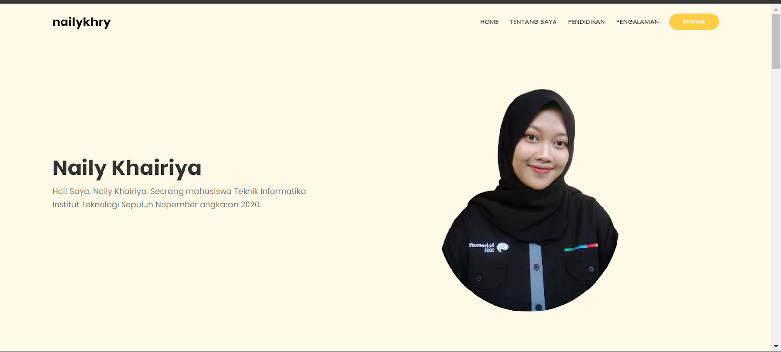
Nama : Naily Khairiya
NRP : 5025201244
Kelas : Pemrograman Web C
Tahun : 2022 / 2023
Tampilan :
Code :index.html
<!DOCTYPE html>
<html lang="en">
<head>
<meta charset="UTF-8" />
<meta name="viewport" content="width=device-width, initial-scale=1.0" />
<title>Portfolio Website | Naily</title>
<link
rel="stylesheet"
href="https://cdnjs.cloudflare.com/ajax/libs/font-awesome/5.15.1/css/all.min.css"
/>
<link
rel="stylesheet"
href="https://unpkg.com/swiper/swiper-bundle.min.css"
/>
<link rel="stylesheet" href="./css/style.css" />
</head>
<body>
<main>
<header id="header">
<div class="overlay overlay-lg">
<img src="./img/shapes/square.png" class="shape square" alt="" />
<img src="./img/shapes/circle.png" class="shape circle" alt="" />
<img
src="./img/shapes/half-circle.png"
class="shape half-circle1"
alt=""
/>
<img
src="./img/shapes/half-circle.png"
class="shape half-circle2"
alt=""
/>
<img src="./img/shapes/x.png" class="shape xshape" alt="" />
<img src="./img/shapes/wave.png" class="shape wave wave1" alt="" />
<img src="./img/shapes/wave.png" class="shape wave wave2" alt="" />
<img src="./img/shapes/triangle.png" class="shape triangle" alt="" />
<img src="./img/shapes/letters.png" class="letters" alt="" />
<img src="./img/shapes/points1.png" class="points points1" alt="" />
</div>
<nav>
<div class="container">
<div class="logo">
<h1>nailykhry</h1>
</div>
<div class="links">
<ul>
<li>
<a href="#header">Home</a>
</li>
<li>
<a href="#about">Tentang Saya</a>
</li>
<li>
<a href="#education">Pendidikan</a>
</li>
<li>
<a href="#experince">Pengalaman</a>
</li>
<li>
<a href="#contact" class="active">Kontak</a>
</li>
</ul>
</div>
<div class="hamburger-menu">
<div class="bar"></div>
</div>
</div>
</nav>
<div class="header-content">
<div class="container grid-2">
<div class="column-1">
<h1 class="header-title">Naily Khairiya</h1>
<p class="text">
Hai! Saya, Naily Khairiya. Seorang mahasiswa Teknik Informatika Institut Teknologi
Sepuluh Nopember angkatan 2020.
</p>
</div>
<div class="column-2 image">
<img
src="./img/shapes/points2.png"
class="points points2"
alt=""
/>
<img src="./img/person.png" class="img-element z-index" alt="profile" />
</div>
</div>
</div>
</header>
<section class="about section" id="about">
<div class="container">
<div class="section-header">
<h3 class="title" data-title="Siapakah Saya?">Tentang Saya</h3>
</div>
<div class="section-body grid-2">
<div class="column-1">
<h3 class="title-sm">Hai! Saya, Naily.</h3>
<p class="text">
Saya berasal dari Temanggung dan saat ini sedang menempuh
pendidikan di Institut Teknologi Sepuluh Nopember. Jurusan yang saya ambil
yaitu Teknik Informatika pada Fakultas Teknologi Elektro dan Informatika Cerdas.
Memiliki beberapa pengalaman kepanitiaan dan organisasi seperti Himpunan Mahasiswa,
organisasi Bidikmisi, kepanitiaan event lomba, seminar, dan konser Schematics,
serta organisasi Koperasi Mahasiswa.
</p>
<br>
</div>
</div>
</div>
</section>
<section class="education section" id="education">
<div class="container">
<div class="section-header">
<h3 class="title" data-title="Bagaimanakah Riwayat Pendidikan Saya?">Pendidikan</h3>
<p class="text">
Berikut merupakan almamater saya
</p>
</div>
<div class="cards">
<div class="card-wrap">
<img
src="./img/shapes/points3.png"
class="points points1 points-sq"
alt=""
/>
<div class="card" data-card="UI/UX">
<div class="card-content z-index">
<img src="img/its.png" class="icon" alt="" />
<h3 class="title-sm">Institut Teknologi Sepuluh Nopember</h3>
<h3>[ 2020 - Sekarang ]</h3>
<p class="text">
Institut Teknologi Sepuluh Nopember (ITS) adalah salah satu perguruan tinggi negeri terbaik di Indonesia yang terletak di Surabaya.
</p>
<a href="https://www.its.ac.id/" class="btn small">Lihat!</a>
</div>
</div>
</div>
<div class="card-wrap">
<div class="card" data-card="Code">
<div class="card-content z-index">
<img src="img/semesta.png" class="icon" alt="" />
<h3 class="title-sm">SMA Semesta Semarang</h3>
<h3>[ 2017 - 2020 ]</h3>
<p class="text">
SMA Semesta merupakan Sekolah Pendidikan Kerjasama (SPK) yang berdiri di Semarang dan mengedepankan
kualitas pembelajaran untuk para peserta didik.
</p>
<a href="https://semesta.sch.id/" class="btn small">Lihat!</a>
</div>
</div>
</div>
</div>
</div>
</section>
<section class="experince section">
<div class="container">
<div class="section-header">
<h3 class="title" data-title="Butiran Perjalanan Hidup">Pengalaman Saya</h3>
<p class="text">
“Ada kekuatan besar ketika sekelompok orang dengan minat yang sama berkumpul untuk bekerja menuju tujuan yang sama.” — Idowu Koyenikan
</p>
</div>
<div class="blog-wrapper">
<div class="blog-wrap">
<div class="blog-card">
<div class="blog-content">
<div class="blog-info">
<h5 class="blog-date">2022</h5>
</div>
<h3 class="title-sm">Staff Departemen Sosial Masyarakat</h3>
<h4>Himpunan Mahasiswa Teknik Computer-Informatika</h4>
<p class="blog-text">
Organisasi Mahasiswa Tingkat jurusan di Teknik Informatika Institut Teknologi Sepuluh Nopember
Surabaya.
</p>
</div>
</div>
</div>
<div class="blog-wrap">
<div class="blog-card">
<div class="blog-content">
<div class="blog-info">
<h5 class="blog-date">2022</h5>
</div>
<h3 class="title-sm">Sekretaris 1</h3>
<h4>Schematics 2022</h4>
<p class="blog-text">
Schematics adalah salah satu event terbesar ITS yang diselenggarakan oleh mahasiswa Teknik Informatika ITS
</p>
</div>
</div>
</div>
<div class="blog-wrap">
<div class="blog-card">
<div class="blog-content">
<div class="blog-info">
<h5 class="blog-date">2021</h5>
</div>
<h3 class="title-sm">Sekretaris</h3>
<h4>Ini Lho ITS! 2022 Forda Temanggung</h4>
<p class="blog-text">
Ini Lho ITS 2020 adalah sebuah event yang membantu calon mahasiswa baru ITS menemukan jurusan yang sesuai minat & bakat yang dimiliki nya.
</p>
</div>
</div>
</div>
<div class="blog-wrap">
<div class="blog-card">
<div class="blog-content">
<div class="blog-info">
<h5 class="blog-date">2022</h5>
</div>
<h3 class="title-sm">Sekretaris 3</h3>
<h4>Schematics 2021</h4>
<p class="blog-text">
Schematics adalah salah satu event terbesar ITS yang diselenggarakan oleh mahasiswa Teknik Informatika ITS
</p>
</div>
</div>
</div>
<div class="blog-wrap">
<div class="blog-card">
<div class="blog-content">
<div class="blog-info">
<h5 class="blog-date">2022</h5>
</div>
<h3 class="title-sm">Asisten Bidang Administrasi Umum</h3>
<h4>Koperasi Mahasiswa Kopma dr. Angka ITS</h4>
<p class="blog-text">
UKM Koperasi Mahasiswa Dr. Angka ITS adalah Unit Kegiatan Mahasiswa yang bergerak dalam usaha mendapatkan profit untuk menyejahterakan anggotanya melalui Sisa Hasil Usaha (SHU).
</p>
</div>
</div>
</div>
<div class="blog-wrap">
<div class="blog-card">
<div class="blog-content">
<div class="blog-info">
<h5 class="blog-date">2021</h5>
</div>
<h3 class="title-sm">Staff Badan Semi Otonom dan Kreasi</h3>
<h4>BIMITS</h4>
<p class="blog-text">
Lembaga Swadaya Mahasiswa (LSM) BIMITS ini merupakan LSM yang terbentuk atas dasar persamaan nasib dan sepenanggungan sebagai kumpulan mahasiswa yang menerima tanggung jawab besar berupa dana beasiswa.
</p>
</div>
</div>
</div>
</div>
</div>
</section>
<section class="contact" id="contact">
<div class="container">
<div class="contact-box">
<div class="contact-info">
<h3 class="title">Get in touch</h3>
<div class="information-wrap">
<div class="information">
<div class="contact-icon">
<i class="fas fa-map-marker-alt"></i>
</div>
<p class="info-text">Temanggung, Jawa Tengah</p>
</div>
<div class="information">
<div class="contact-icon">
<i class="fas fa-paper-plane"></i>
</div>
<p class="info-text">nailykhairiya@gmail.com</p>
</div>
<div class="information">
<div class="contact-icon">
<i class="fas fa-phone-alt"></i>
</div>
<p class="info-text">083821082460</p>
</div>
</div>
</div>
<div class="contact-form">
<h3 class="title">Hubungi Saya</h3>
<div class="row">
<input
type="text"
class="contact-input"
placeholder="Nama Depan"
/>
<input
type="text"
class="contact-input"
placeholder="Nama Belakang"
/>
</div>
<div class="row">
<input type="text" class="contact-input" placeholder="No. HP" />
<input type="email" class="contact-input" placeholder="Email" />
</div>
<div class="row">
<textarea
name="message"
class="contact-input textarea"
placeholder="Pesan"
></textarea>
</div>
<a href="#" class="btn">Kirim</a>
</div>
</div>
</div>
</section>
</main>
<footer class="footer">
<div class="container">
<div class="grid-4">
<div class="grid-4-col footer-about">
<h3 class="title-sm">About</h3>
<p class="text">
Halaman ini merupakan halaman portofolio saya yang sewaktu-waktu bisa bertambah.
</p>
</div>
<div class="grid-4-col footer-links">
<h3 class="title-sm">Links</h3>
<ul>
<li>
<a href="#header">Home</a>
</li>
<li>
<a href="#about">Tentang Saya</a>
</li>
<li>
<a href="#education">Pendidikan</a>
</li>
<li>
<a href="#experince">Pengalaman</a>
</li>
<li>
<a href="#contact" class="active">Kontak</a>
</li>
</ul>
</div>
</div>
<div class="bottom-footer">
<div class="followme-wrap">
<div class="followme">
<h3>Follow me</h3>
<span class="footer-line"></span>
<div class="social-media">
<a href="https://www.instagram.com/nailykhry/">
<i class="fab fa-instagram"></i>
</a>
<a href="https://www.linkedin.com/in/nailykhairiya/">
<i class="fab fa-linkedin-in"></i>
</a>
</div>
</div>
<div class="back-btn-wrap">
<a href="#" class="back-btn">
<i class="fas fa-chevron-up"></i>
</a>
</div>
</div>
</div>
</div>
</footer>
<script src="https://cdnjs.cloudflare.com/ajax/libs/jquery/3.5.1/jquery.min.js"></script>
<script src="https://unpkg.com/swiper/swiper-bundle.min.js"></script>
<script src="./js/app.js"></script>
</body>
</html>
style.css
@import url("https://fonts.googleapis.com/css2?family=Poppins:wght@100;200;300;400;500;600;700;800;900&display=swap");
:root {
--dark-one: #333;
--dark-two: #7a7a7a;
--main-color: #FFCD46;
--light-one: #fff;
--light-two: #f9fafb;
--light-three: #FFFAE7;
}
/* Genral Styles */
*,
*::before,
*::after {
margin: 0;
padding: 0;
box-sizing: border-box;
}
html {
scroll-behavior: smooth;
}
body,
button,
input,
textarea {
font-family: "Poppins", sans-serif;
}
a {
text-decoration: none;
}
ul {
list-style: none;
}
img {
width: 100%;
}
.container {
position: relative;
z-index: 5;
max-width: 92rem;
padding: 0 4rem;
margin: 0 auto;
}
.stop-scrolling {
height: 100%;
overflow: hidden;
}
.grid-2 {
display: grid;
grid-template-columns: repeat(1, 1fr);
align-items: center;
justify-content: center;
}
.text {
font-size: 1.25rem;
color: var(--dark-two);
line-height: 1.6;
}
.column-1 {
margin-right: 1.5rem;
}
.column-2 {
margin-left: 1.5rem;
}
.image {
position: relative;
display: flex;
align-items: center;
justify-content: center;
}
.z-index {
position: relative;
z-index: 2;
}
.overlay {
position: absolute;
width: 100%;
height: 100%;
overflow: hidden;
top: 0;
left: 0;
}
.overlay .shape {
width: initial;
opacity: 0.13;
position: absolute;
}
.overlay.overlay-lg .shape {
height: 55px;
}
.overlay.overlay-lg .shape.wave {
height: initial;
width: 88px;
}
.overlay.overlay-lg .shape.xshape {
height: 38px;
}
.overlay.overlay-sm .shape {
filter: brightness(0) invert(1);
opacity: 0.15;
height: 40px;
}
.overlay.overlay-sm .shape.wave {
height: initial;
width: 70px;
}
.overlay.overlay-sm .shape.xshape {
height: 30px;
}
.points {
opacity: 0.3;
position: absolute;
}
.section {
padding: 7rem 0;
overflow: hidden;
}
.section-header {
text-align: center;
margin-bottom: 1.5rem;
}
.title {
position: relative;
display: inline-block;
padding-bottom: 1rem;
line-height: 1;
font-size: 2.8rem;
margin-bottom: 0.6rem;
}
.title:before {
content: attr(data-title);
display: block;
margin-bottom: 0.4rem;
color: var(--main-color);
font-size: 1.15rem;
font-weight: 500;
text-transform: uppercase;
letter-spacing: 3px;
}
.title:after {
content: "";
position: absolute;
width: 90px;
height: 5px;
border-radius: 3px;
background-color: var(--main-color);
bottom: 0;
left: 50%;
transform: translateX(-50%);
}
.section-header .text {
max-width: 600px;
margin: 0 auto;
}
.title-sm {
color: var(--dark-one);
font-weight: 600;
font-size: 1.6rem;
}
.points-sq {
width: 210px;
}
.btn {
display: inline-block;
padding: 0.85rem 2rem;
background-color: var(--main-color);
color: var(--light-one);
border-radius: 2rem;
font-size: 1.05rem;
text-transform: uppercase;
font-weight: 500;
transition: 0.3s;
}
.btn:hover {
background-color: #FFCD46;
}
.btn.small {
padding: 0.7rem 1.8rem;
font-size: 1rem;
}
/* End Genral Styles */
/* Header */
header {
width: 100%;
background-color: var(--light-three);
overflow: hidden;
position: relative;
}
nav {
width: 100%;
position: relative;
z-index: 50;
}
nav .container {
display: flex;
justify-content: space-between;
height: 6rem;
align-items: center;
}
.logo {
width: 80px;
display: flex;
align-items: center;
}
.links ul {
display: flex;
}
.links a {
display: inline-block;
padding: 0.9rem 1.2rem;
color: var(--dark-one);
font-size: 1.05rem;
text-transform: uppercase;
font-weight: 500;
line-height: 1;
transition: 0.3s;
}
.links a.active {
background-color: var(--main-color);
color: var(--light-one);
border-radius: 2rem;
font-size: 1rem;
padding: 0.9rem 2.1rem;
margin-left: 1rem;
}
.links a:hover {
color: var(--main-color);
}
.links a.active:hover {
color: var(--light-one);
background-color: #FFCD46;
}
.hamburger-menu {
width: 2.7rem;
height: 3rem;
z-index: 100;
position: relative;
display: none;
align-items: center;
justify-content: flex-end;
}
.hamburger-menu .bar {
position: relative;
width: 2.1rem;
height: 3px;
border-radius: 3px;
background-color: var(--dark-one);
transition: 0.5s;
}
.bar:before,
.bar:after {
content: "";
position: absolute;
width: 2.1rem;
height: 3px;
border-radius: 3px;
background-color: var(--dark-one);
transition: 0.5s;
}
.bar:before {
transform: translateY(-9px);
}
.bar:after {
transform: translateY(9px);
}
nav.open .hamburger-menu .bar {
background-color: transparent;
transform: rotate(360deg);
}
nav.open .hamburger-menu .bar:before {
transform: translateY(0) rotate(45deg);
background-color: var(--light-one);
}
nav.open .hamburger-menu .bar:after {
transform: translateY(0) rotate(-45deg);
background-color: var(--light-one);
}
nav.open .links {
transform: translateX(0);
}
.header-content .container.grid-2 {
grid-template-columns: 2.5fr 3.5fr;
min-height: calc(100vh - 6rem);
padding-bottom: 2.5rem;
text-align: left;
}
.header-title {
font-size: 3.8rem;
line-height: 0.8;
color: var(--dark-one);
}
.header-content .text {
margin: 2.15rem 0;
}
.header-content .image .img-element {
max-width: 750px;
}
.img-element{
border-radius: 200px;
width: 300px;
}
header .points1 {
width: 420px;
bottom: -75px;
left: -150px;
}
header .points2 {
width: 70%;
top: 65%;
left: 71%;
}
header .square {
right: 68%;
top: 71%;
}
header .triangle {
right: 7%;
bottom: 75%;
}
header .xshape {
right: 4%;
bottom: 50%;
}
header .half-circle1 {
left: 50%;
bottom: 82%;
}
header .half-circle2 {
left: 5%;
top: 67%;
}
header .wave1 {
bottom: 75%;
left: 20%;
}
header .wave2 {
bottom: 8%;
right: 55%;
}
header .circle {
left: 38%;
bottom: 63%;
}
.letters {
position: absolute;
width: 13.5%;
top: -5px;
left: 15px;
opacity: 0.06;
}
/* End header */
/* education */
.cards {
display: flex;
justify-content: space-around;
flex-wrap: wrap;
width: 100%;
}
.card-wrap {
position: relative;
margin: 1.7rem 0.8rem;
}
.card {
position: relative;
width: 100%;
max-width: 390px;
min-height: 520px;
background-color: var(--light-three);
display: flex;
align-items: center;
justify-content: center;
text-align: center;
padding: 3rem 2rem;
overflow: hidden;
transition: 0.3s;
}
.card:before {
content: attr(data-card);
position: absolute;
top: -15px;
right: -15px;
font-size: 6rem;
font-weight: 800;
line-height: 1;
color: var(--main-color);
opacity: 0.025;
}
.card:after {
content: "";
position: absolute;
width: 100%;
height: 0px;
bottom: 0;
left: 0;
background-color: var(--main-color);
transition: 0.3s;
}
.card-wrap:hover .card {
transform: translateY(-15px);
}
.card-wrap:hover .card:after {
height: 8px;
}
.icon {
width: 90px;
margin-bottom: 1.7rem;
}
.card .title-sm {
line-height: 0.8;
}
.card .text {
font-size: 1.15rem;
margin: 1.8rem 0;
}
.education .points1 {
bottom: -50px;
left: -125px;
opacity: 0.2;
pointer-events: none;
}
.education .points2 {
bottom: -70px;
right: -65px;
opacity: 0.2;
pointer-events: none;
}
/* End education */
/* Portfolio */
.portfolio {
position: relative;
width: 100%;
background-color: var(--light-two);
}
.background-bg {
position: absolute;
width: 100%;
height: 520px;
top: 0;
left: 0;
background-color: var(--main-color);
}
.portfolio .title,
.portfolio .title:before {
color: var(--light-one);
}
.portfolio .title:after {
background-color: var(--light-one);
}
.filter {
width: 100%;
display: flex;
align-items: center;
justify-content: center;
flex-wrap: wrap;
}
.filter-btn {
border: none;
outline: none;
background-color: transparent;
margin: 0.45rem 0.4rem;
padding: 0.85rem 1.8rem;
color: var(--light-one);
text-transform: uppercase;
font-weight: 500;
font-size: 1.1rem;
line-height: 1;
cursor: pointer;
border-radius: 2rem;
transition: 0.3s;
}
.filter-btn.active {
background-color: var(--light-one);
color: var(--main-color);
}
.portfolio .square {
top: 28%;
left: 20%;
}
.portfolio .circle {
top: 8%;
right: 35%;
}
.portfolio .triangle {
bottom: 10%;
right: 4%;
}
.portfolio .half-circle1 {
bottom: 13%;
left: 5%;
}
.portfolio .half-circle2 {
top: 35%;
right: 20%;
}
.portfolio .xshape {
top: 10%;
right: 8%;
}
.portfolio .wave {
top: 38%;
left: 6%;
}
.grid {
width: 100%;
margin: 1.5rem 0;
}
.grid-item {
width: 33.33%;
padding: 1rem 1.2rem;
display: flex;
justify-content: center;
}
.gallery-image {
position: relative;
overflow: hidden;
border-radius: 16px;
height: 330px;
width: 100%;
cursor: pointer;
}
.gallery-image img {
position: absolute;
height: 115%;
width: initial;
top: 50%;
left: 50%;
transform: translate(-50%, -50%);
transform-origin: center;
transition: 0.5s;
}
.gallery-image .img-overlay {
position: absolute;
width: 100%;
height: 100%;
top: 0;
left: 0;
z-index: 2;
color: var(--light-one);
background-color: #FFCD46;
display: flex;
flex-direction: column;
align-items: center;
justify-content: flex-end;
padding: 2rem 3.2rem;
opacity: 0;
transition: 0.5s;
}
.img-overlay .plus {
position: relative;
margin: auto 0;
}
.plus:before,
.plus:after {
content: "";
position: absolute;
width: 4.5rem;
height: 3px;
top: 50%;
left: 50%;
transform: translate(-50%, -50%);
background-color: var(--light-one);
border-radius: 3px;
}
.plus:before {
transform: translate(-50%, -50%) rotate(-90deg);
}
.img-description {
width: 100%;
}
.img-overlay h3 {
font-weight: 600;
text-transform: uppercase;
font-size: 1.5rem;
}
.img-overlay h5 {
font-size: 1.15rem;
font-weight: 300;
}
.gallery-image:hover .img-overlay {
opacity: 1;
}
.gallery-image:hover img {
transform: translate(-50%, -50%) scale(1.1);
}
.more-folio {
display: flex;
justify-content: center;
}
/* End Portfolio */
/* About */
.about {
overflow: hidden;
}
.about img {
max-width: 600px;
}
.about .text {
margin-top: 1rem;
}
.skills {
margin: 1.5rem 0 2.5rem 0;
}
.skill {
margin: 1rem 0;
}
.skill-title {
color: #555;
font-weight: 600;
margin-bottom: 0.3rem;
}
.skill-bar {
width: 70%;
height: 8px;
border-radius: 4px;
background-color: #ece6fa;
position: relative;
overflow: hidden;
}
.skill-progress {
position: absolute;
height: 100%;
width: 0%;
top: 0;
left: 0;
background-color: var(--main-color);
transition: 1s;
}
.about .column-1 {
position: relative;
}
.about .column-1:before {
content: "About";
position: absolute;
font-size: 8rem;
font-weight: 800;
color: var(--main-color);
opacity: 0.04;
top: 20px;
left: 0;
line-height: 0;
}
.about .points {
width: 300px;
top: 65%;
left: 80%;
opacity: 0.1;
}
/* End About */
/* Records */
.records {
position: relative;
background-color: var(--main-color);
padding: 5.2rem 0;
}
.records .container {
display: grid;
grid-template-columns: repeat(4, 1fr);
align-items: center;
justify-content: center;
text-align: center;
grid-column-gap: 1.5rem;
grid-row-gap: 2rem;
}
.record-circle {
width: 180px;
height: 180px;
border-radius: 50%;
margin: 0 auto;
border: 4px solid var(--light-one);
display: flex;
flex-direction: column;
justify-content: center;
color: var(--light-one);
}
.record-circle.active {
background-color: var(--light-one);
color: var(--dark-one);
box-shadow: 0 0 0 15px rgb(255, 255, 255, 0.5);
}
.number {
font-weight: 400;
font-size: 2.35rem;
}
.sub-title {
font-weight: 400;
font-size: 1.12rem;
text-transform: uppercase;
}
.records .square1 {
left: 8%;
top: 10%;
}
.records .square2 {
right: 90px;
bottom: 70px;
}
.records .xshape {
top: 45px;
right: 120px;
}
.records .circle {
left: 7%;
bottom: 50px;
}
.records .triangle {
left: 65%;
bottom: 35px;
}
.records .wave1 {
top: 35px;
right: 30%;
}
.records .wave2 {
bottom: 40px;
left: 28%;
}
.records .half-circle {
top: 30px;
right: 50%;
}
/* End Records */
/* Blog */
.blog-wrapper {
display: flex;
width: 100%;
justify-content: space-around;
flex-wrap: wrap;
}
.blog-wrap {
position: relative;
margin: 1.3rem 0.5rem;
}
.blog-card {
max-width: 420px;
width: 100%;
overflow: hidden;
background-color: var(--light-two);
transition: 0.3s;
position: relative;
}
.blog-card:after {
content: "";
position: absolute;
width: 1100%;
height: 0px;
bottom: 0;
left: 0;
background-color: var(--main-color);
transition: 0.3s;
}
.blog-image {
width: 100%;
height: 270px;
position: relative;
overflow: hidden;
}
.blog-image img {
position: absolute;
height: 105%;
width: initial;
top: 50%;
left: 50%;
transform: translate(-50%, -50%);
transition: 0.5s;
}
.blog-content {
padding: 2.1rem 2.2rem 2.7rem 2.2rem;
}
.blog-info {
display: flex;
flex-wrap: wrap;
margin-bottom: 0.5rem;
}
.blog-info h5 {
color: var(--main-color);
font-weight: 400;
text-transform: uppercase;
font-size: 1.05rem;
letter-spacing: 2px;
}
.blog-date {
margin-right: 2rem;
}
.blog-user i {
margin-right: 0.2rem;
font-size: 1rem;
}
.blog-text {
margin: 0.5rem 0 1.5rem 0;
font-size: 1.2rem;
line-height: 1.6;
color: #666;
}
.blog-card:hover {
transform: translateY(-15px);
}
.blog-card:hover:after {
height: 8px;
}
.blog-card:hover .blog-image img {
transform: translate(-50%, -50%) scale(1.15);
}
.blog .points {
top: 72%;
right: 71%;
opacity: 0.15;
}
/* End Blog */
/* Testimonials */
.testimonials {
background-color: var(--light-two);
overflow: hidden;
}
.testi-content {
margin-top: 6rem;
}
.reviews {
overflow: hidden;
}
.review {
position: relative;
padding: 2rem 1.5rem;
}
.quote {
position: absolute;
top: 0;
left: 0;
color: var(--main-color);
opacity: 0.04;
font-size: 8rem;
}
.rate {
display: flex;
font-size: 1.4rem;
color: #ebc000;
margin-bottom: 1.5rem;
}
.rate i {
margin-right: 0.3rem;
}
.review-text {
font-size: 1.35rem;
font-weight: 300;
color: #444;
line-height: 1.7;
}
.review-info {
margin-top: 2rem;
}
.review-name {
font-size: 1.3rem;
font-weight: 700;
color: var(--dark-one);
}
.review-job {
font-size: 1.15rem;
font-weight: 300;
color: #777;
}
.review-nav {
bottom: 2.2rem;
top: initial;
font-size: 1.8rem;
color: var(--main-color);
}
.swiper-button-next {
right: 2rem;
left: initial;
}
.swiper-button-prev {
right: 4.5rem;
left: initial;
}
.swiper-button-prev:after,
.swiper-button-next:after {
display: none;
}
/* End Testimonials */
/* Contact */
.contact {
position: relative;
width: 100%;
padding: 13.5rem 0 8.5rem;
}
.contact:before,
.contact:after {
content: "";
position: absolute;
width: 100%;
z-index: -1;
left: 0;
}
.contact:before {
top: 0;
height: 40%;
background: url("../img/map.png") center center / cover;
}
.contact:after {
top: 40%;
height: 60%;
background: url("../img/contact-bg.png") center bottom / cover;
}
.contact-box {
width: 100%;
background-color: var(--light-one);
width: 100%;
border-radius: 45px;
padding: 5.5rem 4.5rem;
display: grid;
grid-template-columns: repeat(2, 1fr);
}
.contact-info {
padding-right: 2rem;
}
.contact-form {
padding-left: 2rem;
}
.contact-info .title:after {
left: 0;
transform: initial;
}
.information-wrap {
margin-top: 2rem;
}
.information {
display: flex;
align-items: center;
}
.information:not(:last-child) {
margin-bottom: 1.3rem;
}
.contact-icon {
min-width: 67px;
height: 67px;
display: inline-block;
border-radius: 50%;
background-color: var(--main-color);
color: var(--light-one);
text-align: center;
font-size: 1.4rem;
margin-right: 1rem;
}
.contact-icon i {
line-height: 67px;
}
.info-text {
font-size: 1.3rem;
display: inline-block;
}
.contact-form .title:after {
display: none;
}
.contact-form .title {
margin: 0;
}
.contact-form .row {
width: 100%;
display: grid;
grid-template-columns: repeat(auto-fit, minmax(130px, 1fr));
grid-column-gap: 0.6rem;
}
.contact-input {
padding: 1.2rem 2.1rem;
margin: 0.6rem 0;
border: none;
outline: none;
background: #f3f3f3;
border-radius: 4rem;
font-weight: 600;
font-size: 1.25rem;
transition: 0.3s;
}
.contact-input::placeholder {
font-weight: 400;
}
.contact-input.textarea {
resize: none;
min-height: 280px;
border-radius: 2rem;
}
.contact-input:hover {
background: #ececec;
}
.contact-input:focus {
background: #eaeaea;
}
.contact-input .btn {
margin-top: 0.6rem;
}
/* End Contact */
/* Hire me */
.hireme {
padding: 12rem 0;
}
.hireme .container {
text-align: center;
}
.hireme .title {
margin-bottom: 1.3rem;
}
.hireme .text {
max-width: 1000px;
margin: 0 auto 1.6rem auto;
}
/* End Hire me */
/* Footer */
.footer {
background-color: #222;
padding: 6rem 0;
}
.footer .grid-4 {
display: grid;
grid-template-columns: 3.5fr 2fr 2fr 3fr;
}
.grid-4-col {
padding: 0 1.7rem;
}
.footer .title-sm {
color: #fafafa;
margin-bottom: 0.9rem;
}
.footer .text {
color: #aaa;
}
.footer-links a {
color: #888;
font-size: 1.25rem;
display: inline-block;
margin-bottom: 0.4rem;
transition: 0.3s;
}
.footer-links a:hover {
color: var(--main-color);
}
.footer-input-wrap {
display: grid;
grid-template-columns: auto 50px;
width: 100%;
height: 50px;
border-radius: 30px;
overflow: hidden;
margin-top: 1.2rem;
}
.footer-input {
background: #373737;
color: #333;
outline: none;
border: none;
padding: 0 1.5rem;
font-size: 1.1rem;
transition: 0.3s;
}
.input-arrow {
color: #fff;
background-color: var(--main-color);
display: flex;
align-items: center;
justify-content: center;
font-size: 1.45rem;
transition: 0.3s;
}
.input-arrow:hover {
background-color: #FFCD46;
}
.focus {
background: #fff;
}
.bottom-footer {
margin-top: 5.5rem;
padding: 0 1.7rem;
display: flex;
align-items: center;
justify-content: space-between;
}
.copyright .text {
color: #7b7b7b;
font-size: 1.2rem;
display: inline-block;
text-align: center;
}
.copyright .text span {
color: var(--main-color);
cursor: pointer;
}
.followme-wrap {
display: flex;
}
.followme {
display: flex;
align-items: center;
}
.followme h3 {
color: #7b7b7b;
font-weight: 500;
font-size: 1.3rem;
}
.followme .footer-line {
width: 60px;
height: 2px;
background-color: #7b7b7b;
margin: 0 1.2rem;
display: inline-block;
}
.social-media a {
color: #7b7b7b;
font-size: 1.3rem;
margin-right: 0.4rem;
transition: 0.3s;
}
.social-media a:hover {
color: var(--main-color);
}
.back-btn-wrap {
position: relative;
margin-left: 2.5rem;
}
.back-btn {
display: flex;
align-items: center;
justify-content: center;
height: 55px;
width: 55px;
background-color: var(--main-color);
border-radius: 50%;
color: #fff;
font-size: 1.2rem;
box-shadow: 0 0 20px 1px rgba(0, 0, 0, 0.15);
transition: 0.3s;
position: relative;
z-index: 2;
}
.back-btn:hover {
background-color: #FFCD46;
}
.back-btn-wrap:before {
content: "";
position: absolute;
width: 60px;
height: 60px;
background-color: #fff;
z-index: 1;
top: 50%;
left: 50%;
transform: translate(-50%, -50%) scale(0.7);
border-radius: 50%;
opacity: 0.08;
animation: scale 1.2s ease-out infinite 1s;
}
@keyframes scale {
0% {
transform: translate(-50%, -50%) scale(1);
opacity: 0.15;
}
100% {
transform: translate(-50%, -50%) scale(1.6);
opacity: 0;
}
}
/* End Footer */
@media (max-width: 1280px) {
.text {
font-size: 1rem;
}
.title {
font-size: 2.1rem;
padding-bottom: 0.65rem;
}
.title:before {
margin-bottom: 0.2rem;
font-size: 0.8rem;
letter-spacing: 2px;
}
.title:after {
height: 3.5px;
width: 70px;
}
.title-sm {
font-size: 1.2rem;
}
.btn {
padding: 0.75rem 1.7rem;
font-size: 0.8rem;
}
.btn.small {
padding: 0.65rem 1.6rem;
font-size: 0.7rem;
}
.section-header .text {
max-width: 500px;
}
.section {
padding: 4.5rem 0;
}
.column-1 {
margin-right: 1rem;
}
.column-2 {
margin-left: 1rem;
}
.overlay.overlay-lg .shape {
height: 35px;
}
.overlay.overlay-lg .shape.wave {
height: initial;
width: 63px;
}
.overlay.overlay-lg .shape.xshape {
height: 24px;
}
.overlay.overlay-sm .shape {
height: 24px;
}
.overlay.overlay-sm .shape.wave {
height: initial;
width: 39px;
}
.overlay.overlay-sm .shape.xshape {
height: 19px;
}
header .points1 {
width: 270px;
bottom: -50px;
left: -75px;
}
header .points2 {
width: 340px;
}
header .letters {
width: 11%;
}
.header-content .image .img-element {
max-width: 500px;
}
nav .container {
height: 4.5rem;
}
.header-content .container.grid-2 {
min-height: calc(100vh - 4.5rem);
padding-bottom: 1.5rem;
}
.logo {
width: 65px;
}
.links a {
font-size: 0.8rem;
padding: 0.65rem 0.7rem;
}
.links a.active {
font-size: 0.7rem;
padding: 0.7rem 1.7rem;
margin-left: 0.6rem;
}
.header-title {
font-size: 2.6rem;
}
.header-content .text {
margin: 1.1rem 0;
}
.card {
min-height: 390px;
max-width: 290px;
padding: 2.2rem 1.5rem;
}
.icon {
width: 65px;
margin-bottom: 0.8rem;
}
.card .text {
font-size: 0.9rem;
margin: 1rem 0;
}
.card:before {
font-size: 5rem;
}
.card-wrap {
margin: 1rem 0.6rem;
}
.education .points1 {
left: -60px;
}
.points-sq {
width: 150px;
}
.grid {
margin: 0.8rem 0;
}
.grid-item {
padding: 0.8rem;
}
.gallery-image {
height: 250px;
max-width: 325px;
}
.gallery-image .img-overlay {
padding: 1.4rem 2rem;
}
.plus:before,
.plus:after {
width: 2.8rem;
}
.img-overlay h3 {
font-size: 1.1rem;
}
.img-overlay h5 {
font-size: 0.8rem;
}
.background-bg {
height: 370px;
}
.filter-btn {
padding: 0.6rem 1.45rem;
font-size: 0.7rem;
}
.about img {
max-width: 420px;
}
.about .text {
margin-top: 0.7rem;
}
.skills {
margin: 0.9rem 0 1.7rem 0;
}
.skill-title {
font-size: 1rem;
}
.skill-bar {
height: 6px;
}
.about .column-1:before {
font-size: 6rem;
top: 13px;
}
.about .points {
width: 230px;
left: 65%;
}
.record-circle {
width: 150px;
height: 150px;
border-width: 3px;
}
.record-circle .number {
font-size: 1.8rem;
}
.record-circle .sub-title {
font-size: 0.9rem;
}
.blog-wrap {
margin: 0.7rem 0.5rem;
}
.blog-card {
max-width: 315px;
}
.blog-image {
height: 200px;
}
.blog-content {
padding: 1.8rem 1.7rem 1.9rem 1.7rem;
}
.blog-info {
margin-bottom: 0.2rem;
}
.blog-info > * {
font-size: 0.75rem !important;
}
.blog-user i {
font-size: 0.8rem;
}
.blog-text {
font-size: 0.9rem;
margin: 0.2rem 0 0.8rem 0;
}
.rate {
font-size: 1.15rem;
margin-bottom: 1.1rem;
}
.review-text {
font-size: 1.05rem;
}
.review-info {
margin-top: 1.1rem;
}
.review-name {
font-size: 1.05rem;
}
.review-job {
font-size: 0.85rem;
}
.quote {
font-size: 6.5rem;
}
.review-nav {
font-size: 1.55rem;
}
.swiper-button-next {
right: 2.5rem;
}
.swiper-button-prev {
right: 4.5rem;
}
.contact {
padding: 9rem 0 6rem 0;
}
.contact-form {
padding-left: 1rem;
}
.contact-info {
padding-right: 1rem;
}
.contact-box {
padding: 3.6rem 3rem;
}
.information-wrap {
margin-top: 1.2rem;
}
.contact-icon {
min-width: 50px;
height: 50px;
font-size: 1rem;
margin-right: 0.8rem;
}
.contact-icon i {
line-height: 50px;
}
.info-text {
font-size: 1.05rem;
}
.contact-input {
font-size: 0.9rem;
padding: 0.9rem 1.6rem;
margin: 0.4rem 0;
}
.hireme {
padding: 8rem 0;
}
.footer {
padding: 4rem 0;
}
.footer-links a {
font-size: 1rem;
}
.footer .title-sm {
margin-bottom: 0.5rem;
}
.footer-input-wrap {
height: 36px;
margin-top: 0.8rem;
}
.footer-input {
font-size: 0.9rem;
padding: 0 1.2rem;
}
.input-arrow {
font-size: 1.2rem;
}
.copyright .text {
font-size: 0.95rem;
}
.followme h3 {
font-size: 1.05rem;
}
.followme .footer-line {
margin: 0 0.8rem;
}
.social-media a {
font-size: 1.05rem;
}
.back-btn-wrap {
margin-left: 1.3rem;
}
.back-btn {
width: 43px;
height: 43px;
font-size: 0.9rem;
}
.back-btn-wrap:before {
width: 45px;
height: 45px;
}
}
@media (max-width: 850px) {
.grid-2 {
grid-template-columns: 1fr !important;
}
.column-1 {
margin-right: 0;
margin-bottom: 1rem;
}
.column-2 {
margin-left: 0;
margin-top: 1rem;
}
.hamburger-menu {
display: flex;
}
.header-content {
margin-top: 1rem;
}
.header-title {
font-size: 2.3rem;
}
.header-content .image {
max-width: 400px;
margin: 0 auto;
}
header .column-1 {
max-width: 550px;
margin: 0 auto;
}
.links {
position: fixed;
width: 100%;
height: 100vh;
top: 0;
right: 0;
background-color: #252525;
display: flex;
align-items: center;
justify-content: center;
text-align: center;
transform: translateX(100%);
transition: 0.5s;
}
.links ul {
flex-direction: column;
}
.links a {
color: var(--light-one);
}
.links a.active {
margin-left: 0;
margin: 0.5rem 0;
}
.header-content .container.grid-2 {
min-height: 80vh;
}
.letters,
header .half-circle2,
header .points1,
header .wave2 {
display: none;
}
header .half-circle1 {
bottom: 55%;
left: 23%;
}
header .circle {
left: 8%;
bottom: 40%;
}
header .wave1 {
bottom: 87%;
left: 75%;
}
header .square {
top: initial;
bottom: 5%;
left: 13%;
}
header .triangle {
right: 14%;
bottom: 63%;
}
header .points2 {
width: 280px;
bottom: -10px;
left: 60%;
}
header .xshape {
left: 90%;
top: 54%;
}
.grid-item {
width: 50%;
}
.gallery-image {
height: 210px;
max-width: 270px;
}
.background-bg {
height: 340px;
}
.portfolio .half-circle1,
.portfolio .triangle,
.portfolio .half-circle2 {
display: none;
}
.portfolio .square {
top: 10%;
left: 14%;
}
.portfolio .wave {
top: 33%;
}
.portfolio .circle {
right: 20%;
}
.portfolio .xshape {
top: 25%;
}
.skill-bar {
width: 100%;
}
.about .column-1:before {
font-size: 5rem;
}
.about .points {
top: 60%;
left: 59%;
}
.records .wave1,
.records .triangle {
display: none;
}
.records .container {
grid-template-columns: repeat(2, 1fr);
}
.records .wave2 {
left: 48%;
}
.records .sqaure2 {
bottom: 45%;
right: 50px;
}
.testi-content {
margin-top: 1.7rem;
}
.testi-content .image {
max-width: 500px;
margin: 0 auto;
}
.review-nav {
bottom: 3rem;
}
.contact-box {
grid-template-columns: 1fr;
padding: 3.2rem 2.7rem;
}
.contact-info {
padding-right: 0;
padding-bottom: 0.5rem;
}
.contact-form {
padding-left: 0;
padding-top: 0.5rem;
}
.information-wrap {
margin-top: 0.7rem;
}
.information:not(:last-child) {
margin-bottom: 0.8rem;
}
.contact-input.textarea {
min-height: 220px;
}
.contact:before {
height: 25%;
}
.contact:after {
height: 75%;
top: 25%;
}
.footer .grid-4 {
grid-template-columns: repeat(2, 1fr);
max-width: 500px;
margin: 0 auto;
text-align: center;
}
.footer-about {
grid-column: 1 / 3;
}
.footer-newstletter {
grid-column: 1 / 3;
}
.grid-4-col {
margin: 1rem 0;
padding: 0;
}
.footer-input-wrap {
max-width: 300px;
margin: 0.95rem auto 0 auto;
grid-template-columns: auto 45px;
}
.bottom-footer {
flex-direction: column;
justify-items: center;
align-items: center;
padding: 1.5rem 0 0 0;
margin-top: 2.5rem;
position: relative;
}
.bottom-footer:before {
content: "";
position: absolute;
width: 90%;
max-width: 500px;
height: 1px;
background-color: #7b7b7b;
top: 0;
left: 50%;
transform: translate(-50%, -50%);
}
.followme-wrap {
margin-top: 0.8rem;
}
}
@media (max-width: 600px) {
.grid-item {
width: 100%;
}
}
@media (max-width: 560px) {
.container {
padding: 0 2rem;
}
.title {
font-size: 1.8rem;
}
.text {
font-size: 0.92rem;
}
.overlay.overlay-lg .shape {
height: 28px;
}
.overlay.overlay-lg .shape.wave {
height: initial;
width: 52px;
}
.overlay.overlay-lg .shape.xshape {
height: 22px;
}
.records .container {
grid-template-columns: 1fr;
}
.records .half-circle {
top: 50%;
left: 50px;
}
.records .wave2 {
bottom: 50%;
right: 20px;
left: initial;
}
.records .xshape {
right: 70px;
}
.records .square2 {
bottom: 90px;
right: 40px;
}
.testi-content {
margin-top: 1rem;
}
.review {
padding: 1.5rem 1rem;
}
.review-text {
font-size: 0.9rem;
}
.review-nav {
bottom: 1.5rem;
font-size: 1.3rem;
}
.swiper-button-next {
right: 1.3rem;
}
.swiper-button-prev {
right: 3rem;
}
.contact {
padding: 8rem 0 5rem 0;
}
.contact-info {
display: none;
}
.contact-box {
padding: 2.3rem 2rem;
border-radius: 30px;
}
.contact:before {
background-size: 200%;
}
.contact-form .row {
grid-column-gap: 0.3rem;
}
.contact-input {
font-size: 0.8rem;
padding: 0.8rem 1.4rem;
margin: 0.25rem 0;
}
}
app.js
const filter_btns = document.querySelectorAll(".filter-btn");
const skills_wrap = document.querySelector(".skills");
const skills_bars = document.querySelectorAll(".skill-progress");
const records_wrap = document.querySelector(".records");
const records_numbers = document.querySelectorAll(".number");
const footer_input = document.querySelector(".footer-input");
const hamburger_menu = document.querySelector(".hamburger-menu");
const navbar = document.querySelector("header nav");
const links = document.querySelectorAll(".links a");
footer_input.addEventListener("focus", () => {
footer_input.classList.add("focus");
});
footer_input.addEventListener("blur", () => {
if (footer_input.value != "") return;
footer_input.classList.remove("focus");
});
function closeMenu() {
navbar.classList.remove("open");
document.body.classList.remove("stop-scrolling");
}
hamburger_menu.addEventListener("click", () => {
if (!navbar.classList.contains("open")) {
navbar.classList.add("open");
document.body.classList.add("stop-scrolling");
} else {
closeMenu();
}
});
links.forEach((link) => link.addEventListener("click", () => closeMenu()));
filter_btns.forEach((btn) =>
btn.addEventListener("click", () => {
filter_btns.forEach((button) => button.classList.remove("active"));
btn.classList.add("active");
let filterValue = btn.dataset.filter;
$(".grid").isotope({ filter: filterValue });
})
);
$(".grid").isotope({
itemSelector: ".grid-item",
layoutMode: "fitRows",
transitionDuration: "0.6s",
});
window.addEventListener("scroll", () => {
skillsEffect();
countUp();
});
function checkScroll(el) {
let rect = el.getBoundingClientRect();
if (window.innerHeight >= rect.top + el.offsetHeight) return true;
return false;
}
function skillsEffect() {
if (!checkScroll(skills_wrap)) return;
skills_bars.forEach((skill) => (skill.style.width = skill.dataset.progress));
}
function countUp() {
if (!checkScroll(records_wrap)) return;
records_numbers.forEach((numb) => {
const updateCount = () => {
let currentNum = +numb.innerText;
let maxNum = +numb.dataset.num;
let speed = 100;
const increment = Math.ceil(maxNum / speed);
if (currentNum < maxNum) {
numb.innerText = currentNum + increment;
setTimeout(updateCount, 1);
} else {
numb.innerText = maxNum;
}
};
setTimeout(updateCount, 400);
});
}
var mySwiper = new Swiper(".swiper-container", {
speed: 1100,
slidesPerView: 1,
loop: true,
autoplay: {
delay: 5000,
},
navigation: {
prevEl: ".swiper-button-prev",
nextEl: ".swiper-button-next",
},
});
Link Web : https://nailykhry.github.io/

Comments
Post a Comment